

Is your website doing it’s job? If you’re not seeing the traffic, signup or revenue numbers that you expect then your website might be making some big mistakes, and they might not be the mistakes that you think. Easily overlooked and often improperly implemented, these are the 3 things that your website should never do, and how you can fix each one.
1. Create Ambiguity
A successful websites lives and dies on the strength and clarity of its messaging. It’s not just the copy, successful website messaging flows from site design and architecture all the way down to background images and font-type. Ambiguity is your enemy, so desired action must be clear: filling out a form, buying a product, or calling a phone number. Once you establish the action goals you can battle ambiguity by ensuring that every component of your website plays a part in pushing visitors toward these desired outcomes.
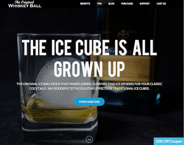
TheWhiskeyBall.com illustrates ambiguity-fighting website design in action. The homepage uses a strong call to action to drive engagement from the very first visitor interaction while the layout and design highlight the unique product and let the The Whiskey Ball speak for itself. The 10% coupon on the bottom reinforces the key message; the product is great and easy to buy right now. Nothing is left to chance here, it’s obvious and effortless for visitors to find and purchase the product, which leads to more conversions and less dropped opportunities.
2. Get Pushy
Video and audio players that start automatically, “sign in to continue” pop-ups on informational pages, oversized images that reduce page speed – forcing unnecessary decisions or experiences can be the fastest way to push visitors away from your website. Instead of getting pushy, you should understand what a visitor wants from your site, and then work to resolve those intentions into a positive outcome.
IndyPlush.com demonstrates how websites can provide variety of choices without getting pushy. From the homepage visitors can reach the shop, watch a video, or learn more about the company. A visitor has clear, logical choices that follow separate paths but all lead into a consistent experience. A big part of the Indy Plush value proposition is the company’s backstory and personality, the homepage promotes both without pushing visitors away.
3. Skimp on Visuals
Low-quality stock photos or mismatched color schemes send a bad message, you absolutely can’t afford to cut visual corners when building an effective website. You don’t need to reinvent the wheel on visual experience, leverage standard practices that visitors expect and appreciate. Resources like Kuler allow you to view user submitted color schemes to get inspiration and see what works for others while quality stock imagery is available from places like iStockphoto.com or Shutterstock.
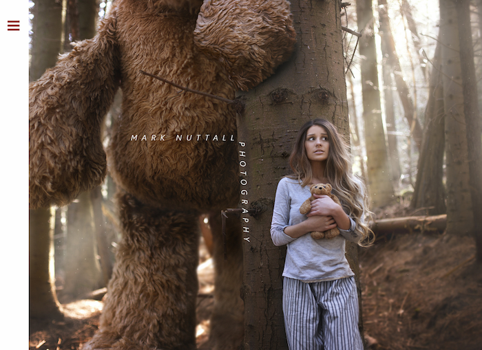
A great example of stunning visuals, Mark Nuttal Photography uses minimalist design elements to place the focus on visually striking photography. The collapsed menu bar reduces noise around the main imagery, while menu icon itself plays an important role as a complementary visual queue. The homepage image is used as the background on all internal pages, keeping a strong visual theme consistent throughout the site. By taking the time craft strong, complementary visual elements, this photography website creates a truly powerful visitor experience.
The first step to improving a website’s issues is to identify them. Now that you’ve taken that important step, it’s time to get back to your website and make sure it isn’t committing these mistakes. Then, you can dive in and create the experience that will help achieve your goals.
(via Weebly)